
This double page spread is from “Why we love Taylor Swift” by Key publishing. This page aims to explore the style of Taylor Swift over the years from 2007-2018. The layout of these pages helps to show the diverse looks she as sported in her career as it is all layed out neatly and clearly for a reader. This makes it easy to see the progression in her style. The use of many images gives a well rounded picture of Taylor Swift thus appealing to an audience who may not know alot about her especially about her style.
The use of captions for each photo makes it very clear to a reader the context of the photo. For example the bottom right image of Swift in a casual outift juxtaposes each of the other kinds of clothes she has worn in the other photos but the caption of “a much more casual look” explains this is not regular for her.
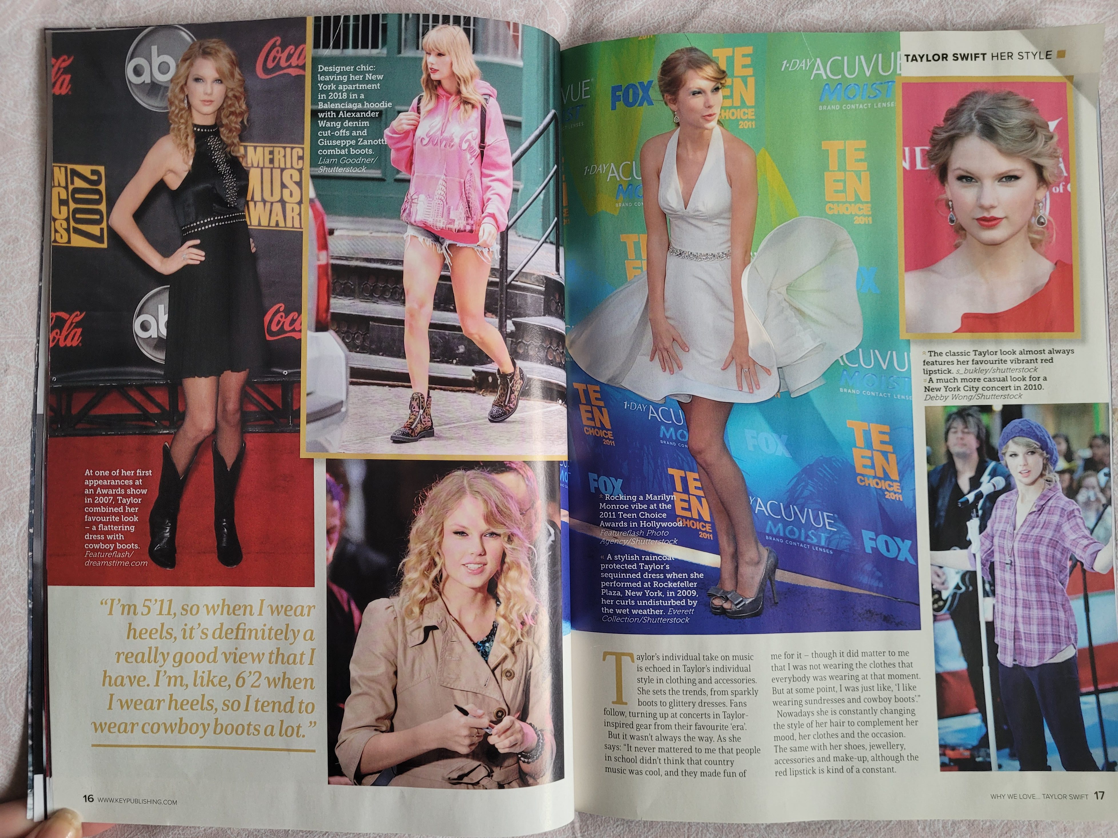
One of the images is much larger than the rest and takes up most of the second page. This image shows Taylor wearing a Marilyn Monroe style dress which is effective in showing the audience where some of her style inspiration may come from.
The use of a frame around one image makes it stand out from the rest as it is outlined with a bold yellow like the colour of the typography. This image is especially important in showing Taylor’s style as the caption expains the iconic red lipstick which she is now almost always seen with.

What would I change about this double page spread?
I wouldn’t change anything about this double page spread from “Why we love Taylor Swift” magazine. I think that this double page spread is useful in showing the progression in Taylor’s style over the years and it clearly displays each of her signature looks which form her style as a whole. Also the colours and typography match the fun and non-serious vibe to the magazine as the font is not too formal so it appeals to a younger audience of Taylor Swift fans.

Leave a comment